When Curve Fitting Isn’t Ideal

This is the second sub problem that I’ve encountered in my DFS golf optimization / forecasting endeavor. The full post on what I’m working on is coming, and I’ll post the link to that here after I finished writing it. This sub problem here deals with finding a value function for how much a golfer is worth depending on where they’re projected to finish in the tournament.

In DFS, each golfer (or player for other sports) is given a salary that shows how much they’re worth. Your job is to come up with a combination of players that give the highest point total so that the sum of their salaries isn’t more than the salary cap. In general, golfers that are expected to do better than others are given a higher salary.

As a part of my analysis, I need to figure out about how much a golfer is worth if they are projected to finish X best out of all the golfers. In other words: If a player is projected to finish 10th in the tournament, what should their salary be?

There are a few ways of thinking about this which I’ll explain below.

1) Use the actual salaries 

I’m running this optimization and re-ranking of players on a week to week basis. So after I re-rank, I could just value the player in 10th place the 10th highest salary of the week. This is what I tried initially, but it gave some funky results. This week is the Memorial, and the 10th player (Tiger) has a salary of 10k, while the 11th players (Bill Haas) has a salary of 9.2k. That drop of 800 is huge when most of the mispricings are in the 400 range. In fact, by using this way of valuing players, Tiger was the worst priced player, and Haas was 2nd best priced player, all because of this gap. Clearly I’ll need a different method.

2) Since we’re actually trying to project how many points these players will score, use the average of points for players who finished in a certain position.

Quickest way to check on this is to graph the values and see what they look like. Sorry, Matplotlib isn’t exactly the prettiest to look at.

combined_pts

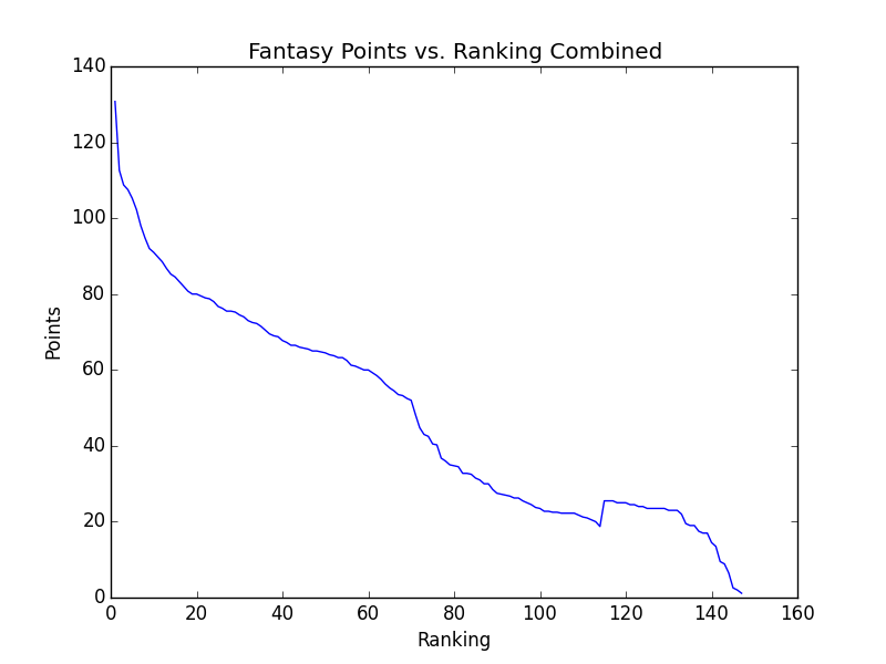
The graph above has that little hitch because I’m only using results from the Colonial and the Byron Nelson. With more results, we can hope to see something a little more standard. Also, I needed to do a little math on the results file that Draftkings gives after a contest is over. Take al look at that writeup here.

Another thing to note about the graph above is that noticeable dropoff around 70-75th place. Only 70 and ties make the cut for a PGA Tour event, and that drop indicates how important it is for players in your lineup to make the cut. If we can see the drop on this graph, you can tell how important it is for real.

3) Fit an exponential decay function to the average points scored to smooth out the plot

Theoretically, we should be seeing a very nice exponential decay for the point scored. The fit looks like the following.

combined_pts_with_fit

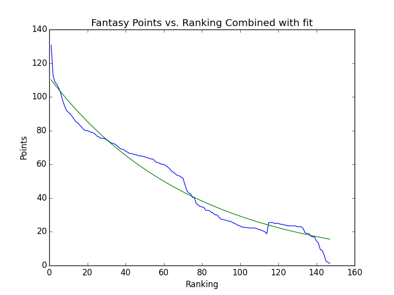
The fit looks pretty decent, but when running it against the past two week’s data, it seems like there isn’t enough variation from one spot to the next. This means that we aren’t able to differentiate as much as I’d like between the great plays and the ok plays.

4) Back to the salaries. They tend to drop off in decaying exponential fashion, so fit a function to the salaries, and use that.

The first step for this method was finding the average salary for each ranking from the salary files I have. Here’s a graph of what that looked like.

average_salaries

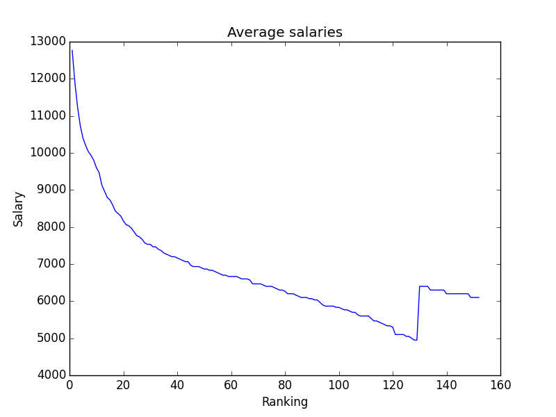
The hitch in the graph was from events that have a non standard field size, in this case, the Heritage and Colonial. To get rid of that hitch, I figured I’d only take into account the top 125 salaries.

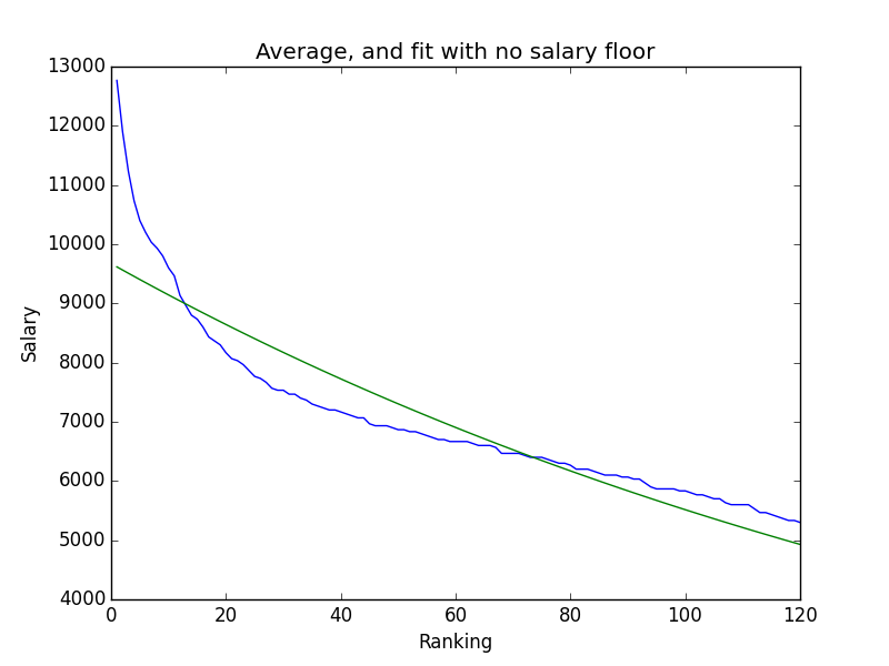
I had two options for the fit, whether or not I would include a y0, or a bottom for the decay function. After graphing the two best fits, the answer to include a floor for the salaries was pretty clear.

You can barely see the curve of the fit

You can barely see the curve of the fit

Much closer

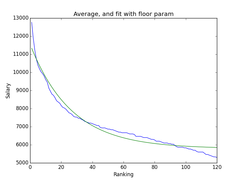
Much closer to the curve

But when I looked at this fit, I wasn’t really pleased with it. That addition ended up being about 6k (5792.21 rounded to two decimals), which meant that no player would ever have a salary lower than that. Since that isn’t the case at all, and sometimes playing golfers under that price point is a good idea, I needed to use the third and final way to figure out values.

5) Just use the averages of the salaries for all the rankings

In the end, all that work fitting a function was for nothing! This main advantage of just using the averages is that it uses actual salaries as a proxy so there’s no fitting. As we can see, the fit we used above didn’t really work too well because it doesn’t take into account the tailing off of the salaries. And when many of the value plays are around that salary level, we need to be as accurate as possible. And in the coming weeks when I have even better averages, these numbers should be better and better.

And by using this method, the initial results look good. In reality though, I need to build a testing method. One that picks a value function, optimizes lineups, and check to see which one actually gets the best results. I can do the eye test for now, but I’ll need hard numbers for real when I have a few more weeks of data. More to come.

Follow on twitter: @jack_schultz

Weekly Fantasy Golf Results and a System of Linear Equations

I had an idea recently about how to use the “wisdom of the crowds” in forecasting performance for weekly fantasy golf. I see the benefits of crowdsourcing all the time working with prediction markets at Inkling Markets, so I figured I could leverage that to get an edge when choosing my lineups. I’ll get into the details of how I’m doing that in a later post since that’s worthy on it’s own, but I found a subproblem that I’d have to solve in order to make it work.

While some of the sites offer player salaries in an easily digestible csv format, they’re a little stingy when it comes to results. They only keep contest results for the last 30 days, and the only downloadable results they offer are the results from contests in the past week, which just show point totals for an entire lineup, not the point totals for individual golfers. And I need those player’s points for testing my forecasting algorithm, as well as using them in making the actual forecasts. One way to figure this out is to scrape the hole by hole data from pgatour.com and apply the site’s scoring algorithm to each of those holes, but I’ve found a better, simpler, and much more elegant solution.

I can model the results csv file as a system of linear equations, and by converting the different user’s lineups into a matrix and vector those equations, numpy can solve for the point totals that each golfer earned during the tournament.

Here’s an example row from that file, with the person’s username hidden.

"Rank","EntryId","EntryName","TimeRemaining","Points","Lineup"
263,85826104, "UNAME (1/100)", 0, 430.50, "(G) Ryan Palmer ,(G) Pat Perez ,(G) Kevin Kisner ,(G) Ben Martin ,(G) Shawn Stefani ,(G) John Peterson "

In order to solve, we need to create two data structures. The first is a num_lineups by num_players matrix of coefficients, where the value is a 1 if the player was used in that lineup, and 0 if he wasn’t. The second is an array of total points scored by that lineup.

The idea is that if we had an array of the points the players scored over the course of the tournament, we should be able to take the dot product of that and the corresponding row in the coefficient matrix to generate the point total of that lineup.

Here’s the code to generate the coefficient matrix and the point array:

points_label = "Points"
lineup_label = "Lineup"
player_coefficients = []
lineup_points = []
with open('outcome.csv', 'rb') as csvfile:
  rows = csv.reader(csvfile)
  headers = rows.next()
  points_index = headers.index(points_label)
  lineup_index = headers.index(lineup_label)
  for row in rows:
    points = float(row[points_index])
    lineup_points.append(points)
    names = [name.strip() for name in row[lineup_index].replace('(G)','').split(',')]
    lineup_players = [0] * player_count
    for name in names:
      lineup_players[player_list.index(name)] = 1
      player_coefficients.append(lineup_players)

From here, all we need to do is convert those arrays into numpy arrays, and run numpy’s linear algebra least squares algorithm to get the solution array!

coefficient_matrix = np.array(player_coefficients)
point_array = np.array(lineup_points).transpose()
solution = np.linalg.lstsq(coefficient_matrix, point_array)
player_points = list(solution[0])

Initially, I tried to use the numpy’s solve algorithm, but by looking at the docs realized that solve dealt with square coefficient matrices (something that I still remember from all those math classes). The lstsqrs method is used to get approximate results from rectangular matrices as is the case here.

Printing out the results yields the following results for the top and bottom 10:

Chris Kirk: 126.0
Jason Bohn: 105.5
Brandt Snedeker: 102.0
Jordan Spieth: 101.5
Kevin Kisner: 99.0
George McNeill: 96.5
Pat Perez: 95.0
Adam Hadwin: 92.0
Ian Poulter: 87.5
Brian Harman: 87.0
...
Kenny Perry: 18.0
Jason Kokrak: 17.5
Jonas Blixt: 16.5
Corey Pavin: 16.0
Bo Van Pelt: 15.0
David Toms: 14.0
Brian Davis: 11.5
Tom Watson: 4.61852778244e-13
Tom Purtzer: 3.87245790989e-13
Scott Stallings: 2.84217094304e-13

Chris Kirk won so him having the highest point total makes sense, and the three guys at the bottom with zero points all withdrew so they should be at 0 points. Unfortunate for the guys who didn’t take them out of their lineups, but they gotta pay a little more attention!

Only issue with the final result is that I only end up with point totals from 117 players, when 133 teed it up at the beginning of the tournament. That means that we’re missing point totals from some of the guys. That being said, I’m going to assume that those players weren’t picked because they weren’t likely to play well, so hopefully that 117 offer a good representation of point totals. Also, could easily be that draftkings in this case only listed 117 players to choose from. I’ll need to investigate this week.

In the end, it took about 3 hours to write the code and write this post. It’s fun little problems like this that really remind you that programming is fun and has value. Being able to create technical solution to something you’re interested in is probably the best part about being a programmer. Check out the entire script in this gist.

Follow on twitter.