Cluster analysis can be considered one of the pillars of machine learning, and yet it’s one that’s difficult to talk about.
First off, it’s difficult to find specific use cases for clustering, other than pretty pictures. When looking through the wiki page on clustering, we’re told one of the uses is market research, where analysts use surveys to group together customers for market segmentation. That sounds great in theory, but the results don’t end with specific numbers telling the researchers what to do. Second, in so many cases, the hardest part of data science projects, or tutorials, is finding real world data that have the different results you want to show. In this case, I’m incredibly lucky.
I have a golf background, and on U.S. Open’s website, they have these interactive graphs that show where each ball was located after each stroke for every player. If you click around, you can see who hit what shot, how far the shot went and how far remains between the ball and the hole. For cluster analysis, we’re going to use the location. For you to check out how I got the data, look and read here.
Shinnecock Hills, the host of the 2018 U.S. Open last week, has a few parts of the course where balls roll to collection areas into groups, or, ya know, clusters. Here are the specific shots our clustered data is coming from.
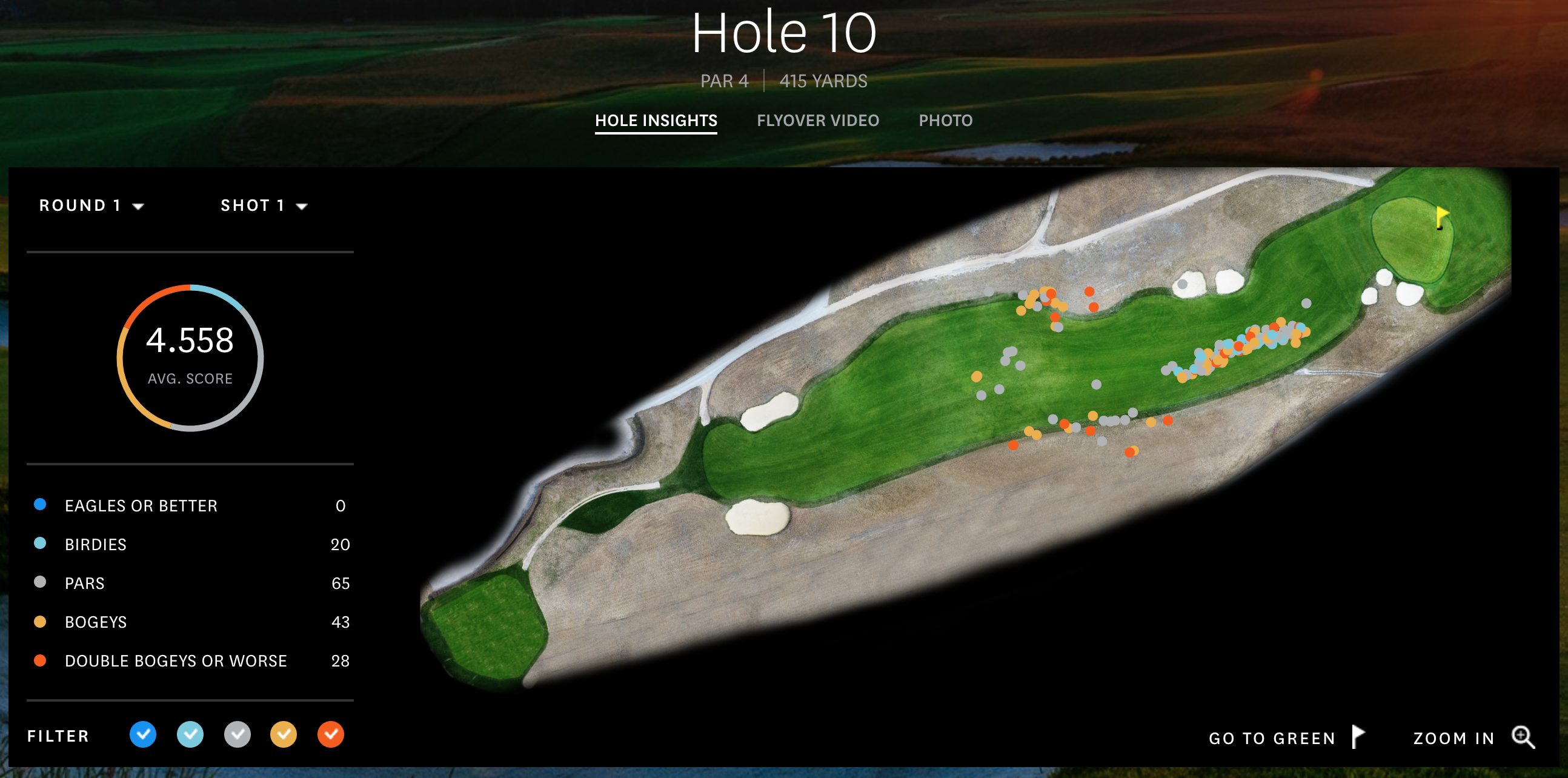
Hole 10, Round 1, Off the Tee
The description that the USGA gives hole number 10 is
The player faces a decision from the tee: hit a shot of about 220 yards to a plateau, leaving a relatively level lie, or drive it over the hill. Distance control is critical on the approach shot, whether from 180 yards or so to a green on a similar plateau, or with a shorter club at the bottom of the hill or, more dauntingly, part of the way down the hill. The approach is typically downwind, to a green with a closely mown area behind it.
First I’ll say, always hit driver off the tee. Look at the cluster! If you get it down the hill you’ll be in the fairway! In the vast, vast majority of the time, it’s better to be closer to the hole. Golf tips aside, when I first saw this graph, it popped out as a great example to use as a clustering example.
Shift command 4 if you want selective screenshots
When looking at this picture, the dots represent where the players hit their tee shots on hole 10 in the first round, and the colors show how many strokes it took them to finish the hole in relation to par. For this, we’re ignoring the final score and only looking at the shots themselves.
Hole 10, Round 1, Approaching the green
One data set isn’t good enough to demonstrate the differences of the algorithms, and I wanted to find an example of a green with collection areas that would make approach shots group together. Little did I know, the 10th green, the same hole as the one above showing the drives, is the best example out there. If you’re short, it rolls back to you. If you’re long, it rolls away. You gotta be sure to hit the green. You can see that here.
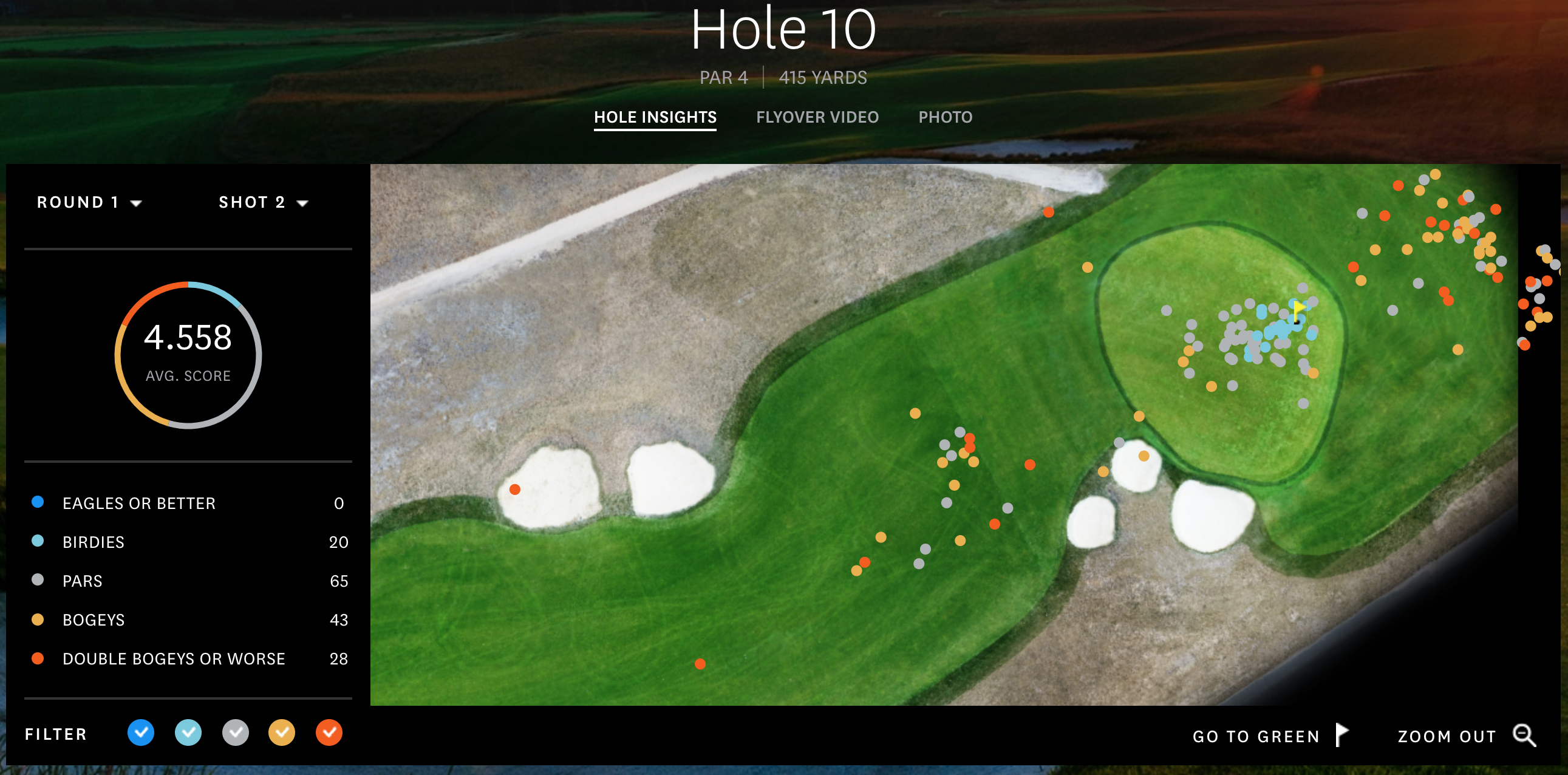
So this will be a second example of data for all the algorithms.
Algorithms themselves
This time, in this blog post, I’m only looking for results, not going through the algorithms themselves. There are other tutorials online talking about them, but for now at least, we’re only getting little introductions to the algorithms and thoughts.
Instead, I use the Scikit-Learn implementations of the algorithms. Scikit-Learn offers plenty of clustering algorithms, which I could spend hours using and writing about, but for this post, the ones I chose are K Means, DBSCAN, Mean Shift, Agglomerative Clustering.
Other Notes
Before going in to the algorithms, here are a few notes on what to expect.
- Elevation is key as to why there are clusters. If you look around the other holes, you won’t see close to as much distribution and clusters of shot results. Now, if we had elevation as a data point as well, then we could really do some great cluster analyses.
- The X and Y values on the sides of the graphs represent yards from the hole, which is located at the (0,0) location. If you look at the first post, I show that if you measure the hypotenuse using those X and Y numbers, you’ll have the yardage to the pin.
- This isn’t a vast data set. We have 156 points in the two data sets because that’s how many players there were in the tournament.
- If you’re wondering which part took the longest, it was writing the matplotlib code to automatically create figures with multiple plots for different input variables, and have them all show up at once. Presentation is key, and that took tons of time.
Code
I put all the code and data on Github here, so if you want to see what’s going on behind the scenes and what it took to do the analysis, look there.
Questions, comments, concerns, notes, thoughts, etc: contact, twitter, and golf twitter if you’re interested in that too. Ok, algorithm time.
K Means
I’m starting with K Means because this was the clustering algorithm I was first introduced to, and one that I had to write myself during a machine learning class in college.
